Saturday, 30 March 2013


Evaluation Question 1
In what ways does your media products use, develop or challenge forms and conventions of real media products.
Our media product supports many of the conventions of professional media products. The reason for this is because while we where filming, we kept all the specific rules in mind and made sure we didn't break any rules.
For example the 180 degree rule when we are filming, we have many shots throughout our media piece where we panned the camera and when doing that it is very easy to break the 180 degree rule.
We found ourselves filming scenes many times over, this was not always because we messed up the filming, sometimes the characters minor facial expressions were not suited for the scene, the scene was instigating horror but their facial expressions suggested otherwise, to keep consistency and the horror theme going we had to re film and make sure everyone knew the how they had to act specifically.
One thing that we have done is kept our whole media production in black and white, from the people who have viewed it we have had the same feedback. we are fully aware how this may challenge the conventions of a real horror trailer. However there are two ways to look at this, you can look at it in the form of consistency, in that sense we've stuck to the book and ket the whole horror trailer in black and white. However when you look at other horror trailers they are never all in black and white, they may be mostly but there is always a scene that has colour and this adds effect. The one issue we had with filming was that the times we got together to film tended to be during the day, so the scenes we did film had to be darkened and when using the Mac computer and darkening the scenes, it did not always look to good when they where darkened so we had to play about with the balance of the colour, so by making them black and white and then messing around with the darkness of the scene we where able to come up with the darkness we needed, that is then when we applied it to everything because at the time it was consistency that we where looking to achieve.
Another way me have challenged the conventions of a real media products is the monologue, we don't have much throughout our piece. This was the case last year also, we personally feel that we are able to achieve quite a professional piece without having much monologue. When our media piece was viewed by our teacher this is one of the first thing they picked up on immediately which is possible a floor in the piece. So we have made plans to do some voice over however not fully decided as to whether we are going to or not. One thing which i personally noticed was how we act when we are in front of the camera, we pay generous amounts of attention to how we act to be able to give as much detail away as we can through our actions, this is a possibility as to why we don't intend to have much monologue in our finished media product.
For example one of things we included was a P.O.V shot, and when we filmed this and reviewed it on the Mac computers it was obvious due to the shadow on the floor that the camera was in hand however we re filmed the scene and although in the second take we filmed it exactly the same however you could not fully tell that it was a camera in hand it looked as if the character was having a drink, which then brings us onto the other idea behind the filming, the characters have been previously drinking, instead of having monologue to show this we show it through their actions. In the media piece it is shown through the silly mistakes and the dopiness that the characters portray, for example going to the wrong vehicle, walking in a strange slurry manner. Also the scene where the two main character enter the vehicle, one of them instantly shuts his eyes in the car before the shock of something in the back seat scares them back out.
Another way we may have challenged the conventions of a typical horror trailer is with some of the scenes mentioned int he previous paragraph, although it is a horror trailer and the intention is to scare yet interest an audience, however the part where the two main characters are portraying that they are under the influence brings an element of comedy, because they go to the wrong car and then have a tug for the car keys and this comes across as quite funny because they aren't sober and they are not aware. this may challenge the conventions of a professional media product however i personally think it may be a good thing because it shows something slightly different and bending the conventions is not seen as a bad thing by us a group.
What may be seen as a flaw in our product as previously mentioned is we do not have enough monologue however we do try and make up for that with the filming. i can only be accounted for so much however because the narrative and the story need to come together and as we have not paid full attention to monologue we may have to add parts to make up and explain in our piece more of the story line, in the first few draughts of our media piece it was pretty obvious to ourselves and the people who viewed it that the story was not fully clear, and we did more filming to help clarify what the story was about however as i said there is only so much filming you can do for a trailer that is going to last roughly 2 minutes.
Evaluation Question 2
How effective is the combination of your main
product and ancillary text?
Every trailer is important to the promotion of a movie
however this is not the most important factor of promoting a movie. The
recognition of any movie trailer comes from three main products, which
are:
Trailer – This is the first ad released when a movie has been made. There are many ways in which these trailers can be seen by the viewers. Depending on what the promoters would like to do they could show these trailers in between programmes which are the best way of bringing in the public to watch a movie. Other then this company places the trailer onto YouTube which is one of the biggest used online services. If the ad is good and attracts viewers they will possibly share the video around to other friends on social network sites like Facebook or Twitter.
Poster – the film poster is another important factor which
needs to coincide with the trailer, for e.g. you cannot have a comedy trailer if
the poster is a horror. This is misleading and the producers will most likely
loose viewers. Posters are used all around different cities being part of
billboards, bus stops, and on walls. This is also a great way to bring in the
viewers and for that reason the poster will need to be of high
quality.
Magazine – Many people read magazines, in these magazines
there are many different advertisements which are about different purposes. To
have a magazine front cover for a movie it will need to be the same quality as
the poster is as it plays the same importance. This also attracts people to
watch the movie.
All three products are required to be of the same quality
and used for the same purpose in this case to advertise the release of a movie.
As we have decided to create a horror movie trailer we are
also required to create a magazine front cover and also a poster. We have
received feedback on our main product which is the trailer and the reactions we
have got back is perfect as we did receive a few negative points however the
trailer applies to the genre perfectly according to the audience the feedback
also gave us an idea of the effectiveness of the trailer.
With the combination of the main product, poster and
magazine it has made the chosen genre more applicable and effective. We were
using Photoshop to create our final poster and magazine. The design of both
products was due to the amount of research we had carried out, researching many
horror posters and magazines. It is very important for any movie which contains
all three products to keep the consistency of the colours used and the house
style. We decided to use an image of the character for each of our products to
keep consistent, linking to the actual trailer. On the poster we used a typical
layout which every other professional poster has to keep ours professional. The
layout contains the characters names at the top with the cast and crew at the
bottom. When carrying out research we had found out the many people look towards
the middle or slightly above which we experimented and worked. Due to the
experiment we contained the item we wanted to be the most attracting in the
middle and slightly above is an eye which contains a little message in it. When
looking properly into the eye you will be able to see the little text saying no
escape “NO ESCAPE” this text is very effective as it is placed in the eye.
Looking into the eyes of people you can see what they are thinking or the mood
that they could be in. In a horror movie when the eyes are looked into there is
a clear sign of fear which is why we decided to have that message. Also being
consistent we have not used many colours on the poster as the actual trailer is
shown in black and white which creates a special kind of atmosphere. Also the
text is in your face and slightly blended in to the background. The text is also
right in your face as it creates it also places a big part in creating an
effect. The most valuable text on the page is the quotations from magazines
which create credibility; this also has a good effect on the viewer as the
reviews for the movie has come back positive.
In my opinion I think there is a great combination between
the main product, and the ancillary text (magazine cover, poster). We as a group
have taken a key element from the trailer which we applied to the ancillary text
so all products are consistent.
One of the main aspects of our film is the colour of the
font matched with the colour of the trailer. The font is written in a black and
white on the poster however the whole trailer is shown in black and white,
whereas the magazine is mainly black with white lines.
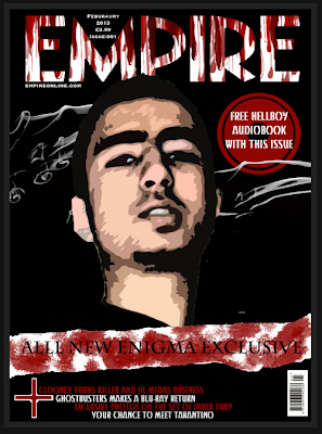
As you can see on the magazine there are the white swirly
lines over the black background. Our decision to use these lines was due to
research taken out, keeping the magazine simple yet effective. Many other Empire
horror magazines don’t really have anything behind the main character as there
is no room but with ours we have also created a mysterious effect on our final
poster the colour scheme is once again carried on and it is easy to see the
contrast of the black and white areas. The eye is one of the characters from our
trailer you see it nice a clearly as it is shown around a light backgrounds
however at the bottom the is this mysterious figure hidden with a black
background.
Another key element is the use of images on each
ancillary product. We have once again kept consistence with the 3 products as
from the trailer we have obtained images which are now used on both the poster
and the magazine cover. In the trailer we do not get much close ups of the
characters however now we get slightly more off the characters. I think this is
a quite effective combination between the main product and the text. As in the
trailer we get a slight turn in mood with one of the characters, which we can
also tell by looking to the bottom of the poster.
The colour of all three products are dark and mysterious but
all in different way. The poster is the most effective when it comes to the use
of the darkened colours as the images help out. Out of all three products the
magazine has is the one which lightens the mood as it is colourful compared to
the poster and trailer.
The main thing that will get the movie a big reputation is
the consistency we have used throughout each product. In my opinion all three
products are as important as each other however the poster will be the main hit
for our movie as it creates the most impact as a horror product.
Tuesday, 26 February 2013
Magazine Cover
We changed our cover complete as i listed in a previous post, however even the second copy had some errors once we properly evaluated it, small touches which make all the difference.
So we have re-evaluated with our media teacher and noted down once again all the things that we feel need to be changed, Comparing it also to the professional edition of Empire.
 This was the second edition of our poster, Compared to the last one we added all the necessary information such as the date etc. Then added the white strip as you can see towards the bottom of the image.
One way we looked to see if it was perfect was by looking at it from a distance, then we realised the writing in the circle on the right hand side was not easily read so we then got to work and changed things around, more so then planned.
This is the new improved version of our magazine cover. As you can see we changed the writing and removed the smaller image. And fully changed the main image. The reason is because simply this image looked better, we used a different effect and made the image lighter and it just seemed more outgoing.
This is the new improved poster, There is a lot more text on it and also we needed a catch line which we have also come up with.
One thing we missed through evaluation to give the poster substance was reviews from different magazines eg. We added these few details and they made a big difference.
So we have re-evaluated with our media teacher and noted down once again all the things that we feel need to be changed, Comparing it also to the professional edition of Empire.

One way we looked to see if it was perfect was by looking at it from a distance, then we realised the writing in the circle on the right hand side was not easily read so we then got to work and changed things around, more so then planned.

This is the new improved version of our magazine cover. As you can see we changed the writing and removed the smaller image. And fully changed the main image. The reason is because simply this image looked better, we used a different effect and made the image lighter and it just seemed more outgoing.

One thing we missed through evaluation to give the poster substance was reviews from different magazines eg. We added these few details and they made a big difference.
Monday, 25 February 2013
Filming To Be Done
Although we were very ahead of the game in the beginning with filming, every time we watch over the footage in the order we have put it, it gives us the impression that something is missing and there is something we can add. So now we have gone through what we have slowly and taken notes of what we feel we can add and move around.
We have created many transitions and effects from scratch which we are very proud off however to have them separated correctly and put in a proper place throughout the film we are going to have to film more footage.
Most of our footage was filmed in a house which was empty and so we managed to achieve an eery effect with it, then we moved into a woodland area which was meant to be the lead up. and although we are filming a trailer, we have no real concluding point towards the end which i personally feel is needed.
I also feel we need some more scenes in the middle of the footage, not only because we have more room for it, but because we as a group feel there needs to be more because when it comes to a trailer, although you don't want to give all of the story away, its important to give the viewer enough so they want to see more, this is one point i think we need to work on.
Thursday, 21 February 2013
Magazine Cover

The first thing we forgot was the price, as previously mentioned these are just technicalities however they are what give the magazine that professional look.
Another small thing we forgot is the date. By putting the date on we can show we paid attention to detail. Also we have a bar code, a bar code is scanned to give the employee the price and so it looks better if there is a price on the cover.
We currently have 3 images on our magazine cover, however when comparing ours with a professional edition of Empire, we realised that they ten to have 2 slightly broader images and then more text. So we are currently working on removing one of the images.
Another problem we are having is with the text. The text that is currently on the page is proving to be confusing compared to a real edition of Empire. So as well as taking things off the page we are re-arranging the text in contrast to the image so its clear what each piece of text is for.
Also one one of the chosen images has been removed and the text organised, we are going to have a lot of space on the cover. So while looking at Empire's layout we saw they had less images and more text, the text they had was all of different colours, sizes and fonts however still proved to catch the readers eye. This is what we intend to do get rid of things and make space for more text.
We have also decided to make the images we are keeping smaller, or have one of them large and one significantly smaller.
 |
| This is the edition of Empire we are comparing our cover with. |
Tuesday, 19 February 2013
Movie Poster

What you see on the left hand side is what we came up with. Compared to the poster which we had last year, this is very simple, the poster last year had much more going on with regards to detail and colours.
So we went for the total opposite for this year. This time the colour scheme = Black&White. Detail very limited and writing also limited. And as you can see we managed to create something as effective using much less activity.
Another thing is the text right at the bottom. Usually, we what we did last year was take it off another poster. However in this poster we edited out all the information and replaced it with our actual information, this shows professionalism and attention to detail.
After evaluating our finished piece, we realised that it was lacking text. On movie posters there tends to be text which gives part of the movie away or just a rating which shows what a certain magazine or newspaper thought of it. This is something we did not add and through evaluation and criticism we realised. We are now thinking of a strap-line, rating to add onto the poster to give some more information for example.
Strap-lines tend to be very short but just enough to want someone to look further and maybe watch the film. For this reason we are going to add one and upload it once it has been completed.
Tuesday, 29 January 2013
Rough Cut Analysis
This is some of the filming we have done so far, we have more filming done however when we sat down to piece it together, this is what we found went best together.
Most of which so far is in black and white, we have scenes filmed in the house where the lighting is fully natural and there has been no editing done, we intend to keep them scenes that way, by doing this we hope it will give the black and white scenes more effect and significance. A sort of contrast to show the fully lit scenes where everything is good and well with the friends, and then the darkness to show the darkness the friends face.
The noises added in are temporary, as we film further we are going to hopefully look for ways to create other suspicious noises to add in, we want to create our own, to go along with the rest of the film so far and be unique. As you saw in this footage we still need to add tag-lines, we feel that tag-lines in most other films although provide a scare in themselves, they are very similar in may horror trailers, we are still thinking of what to write and add, along with the name.
For the name, we wanted a powerful name, however a name that portrays mystery at the same time, ambiguous, inexplicable, Enigma is the one we decided to stick with in the end, as these words mean the same thing. The idea of something being unexplainable is what scares an audience, they go to the cinema to see a horror, what they expect is to see things that they would not expect to happen in their lives or in their day to day life. Which is why when at the beginning of a film when it says it is based on a true story, it tends to have more effect on the audience.
Most things are made to seem mundane in black and white, the few things moving for instance me and Hassan will stick out even more, the colours are gone, makes most of the scene seem lifeless which also ads to the horror effect.
Filming To Be Done
A lot of what we do when filming is very spontaneous, although we have in mind the ideas the plans which we have come up with during lesson time, when we are on set so many more ideas come to mind.
Today we have been told that we have just over three weeks before the hand in date of all of our practical work. Although we have been paying significantly more attention to the blog it is now time to go back to the practical work and give it some finishing touches and possible add to it to make it that bit better.
Quick cuts: with the filming we already have, there is too many shots which take too long to kick in. There is story before something happens and although this helps the viewer understand what the story is about, when there is too much of it its almost boring, its expected in the next scene and you lose the element of surprise. Therefore it is important to have a balance, so they understand what they're actually being scared of.
Establishing shots: These shots give the audience a feel of the location. Last year we couldn't really afford to do that too much due to the locations we had chose to film in, this year we have moved right out and filming in very different locations, dark wooded areas with rocky streams, so by having an establishing shot, we can add effect to the whole of the video. Most of the filming
After effects
Transitions
Another thing we noticed was part of filming did not quite add up which means we are going to go and re-film some of the scenes and then that will allow us to put our media piece together so it makes sense.
Other scenes such as scary moments throughout, what he have at the moment puts more of a story to the trailer however, scary moments which appear throughout the trailer for split seconds.
Today we have been told that we have just over three weeks before the hand in date of all of our practical work. Although we have been paying significantly more attention to the blog it is now time to go back to the practical work and give it some finishing touches and possible add to it to make it that bit better.
Quick cuts: with the filming we already have, there is too many shots which take too long to kick in. There is story before something happens and although this helps the viewer understand what the story is about, when there is too much of it its almost boring, its expected in the next scene and you lose the element of surprise. Therefore it is important to have a balance, so they understand what they're actually being scared of.
Establishing shots: These shots give the audience a feel of the location. Last year we couldn't really afford to do that too much due to the locations we had chose to film in, this year we have moved right out and filming in very different locations, dark wooded areas with rocky streams, so by having an establishing shot, we can add effect to the whole of the video. Most of the filming
After effects
Transitions
Another thing we noticed was part of filming did not quite add up which means we are going to go and re-film some of the scenes and then that will allow us to put our media piece together so it makes sense.
After Effects
While creating our after effects, we came across a new effect which appealed to us. It was of a face talking and an effect in front of the face so no features of the face where seen.
As our media practical piece is based on horror this effect really appealed to us and we thought it would go perfectly with what we have currently filmed.
It was not an effect we are largely familiar with and so it took lots of research and following videos which we found on the Internet, however we have now managed to create an effect which has been finished and polished to perfection. Now when we come to arranging our footage into a full film, we are then able to add this transition where we feel it is best.
This effect as we executed it, we saw how simple it really was. We went to a dark room and filmed myself, just talking to the camera, as funny as it sounds that was the base of this whole transition. Simply talking to the camera, and i had to keep my head perfectly straight and at a certain height for the camera and just spoke with a slight aggression to the camera.
Once it was filmed we then it was uploaded to the Mac and the first thing we did was mute the sound. then, the it became an aggressive conversation with the camera as seen in the video above.
After my face was cut out so it was the only thing in shot to edit and then the editing began.
Subscribe to:
Comments (Atom)