How effective is the combination of your main
product and ancillary text?
Every trailer is important to the promotion of a movie
however this is not the most important factor of promoting a movie. The
recognition of any movie trailer comes from three main products, which
are:
Trailer – This is the first ad released when a movie has been made. There are many ways in which these trailers can be seen by the viewers. Depending on what the promoters would like to do they could show these trailers in between programmes which are the best way of bringing in the public to watch a movie. Other then this company places the trailer onto YouTube which is one of the biggest used online services. If the ad is good and attracts viewers they will possibly share the video around to other friends on social network sites like Facebook or Twitter.
Poster – the film poster is another important factor which
needs to coincide with the trailer, for e.g. you cannot have a comedy trailer if
the poster is a horror. This is misleading and the producers will most likely
loose viewers. Posters are used all around different cities being part of
billboards, bus stops, and on walls. This is also a great way to bring in the
viewers and for that reason the poster will need to be of high
quality.
Magazine – Many people read magazines, in these magazines
there are many different advertisements which are about different purposes. To
have a magazine front cover for a movie it will need to be the same quality as
the poster is as it plays the same importance. This also attracts people to
watch the movie.
All three products are required to be of the same quality
and used for the same purpose in this case to advertise the release of a movie.
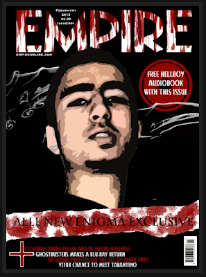
As we have decided to create a horror movie trailer we are
also required to create a magazine front cover and also a poster. We have
received feedback on our main product which is the trailer and the reactions we
have got back is perfect as we did receive a few negative points however the
trailer applies to the genre perfectly according to the audience the feedback
also gave us an idea of the effectiveness of the trailer.
With the combination of the main product, poster and
magazine it has made the chosen genre more applicable and effective. We were
using Photoshop to create our final poster and magazine. The design of both
products was due to the amount of research we had carried out, researching many
horror posters and magazines. It is very important for any movie which contains
all three products to keep the consistency of the colours used and the house
style. We decided to use an image of the character for each of our products to
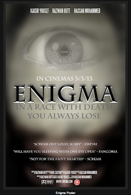
keep consistent, linking to the actual trailer. On the poster we used a typical
layout which every other professional poster has to keep ours professional. The
layout contains the characters names at the top with the cast and crew at the
bottom. When carrying out research we had found out the many people look towards
the middle or slightly above which we experimented and worked. Due to the
experiment we contained the item we wanted to be the most attracting in the
middle and slightly above is an eye which contains a little message in it. When
looking properly into the eye you will be able to see the little text saying no
escape “NO ESCAPE” this text is very effective as it is placed in the eye.
Looking into the eyes of people you can see what they are thinking or the mood
that they could be in. In a horror movie when the eyes are looked into there is
a clear sign of fear which is why we decided to have that message. Also being
consistent we have not used many colours on the poster as the actual trailer is
shown in black and white which creates a special kind of atmosphere. Also the
text is in your face and slightly blended in to the background. The text is also
right in your face as it creates it also places a big part in creating an
effect. The most valuable text on the page is the quotations from magazines
which create credibility; this also has a good effect on the viewer as the
reviews for the movie has come back positive.
In my opinion I think there is a great combination between
the main product, and the ancillary text (magazine cover, poster). We as a group
have taken a key element from the trailer which we applied to the ancillary text
so all products are consistent.
One of the main aspects of our film is the colour of the
font matched with the colour of the trailer. The font is written in a black and
white on the poster however the whole trailer is shown in black and white,
whereas the magazine is mainly black with white lines.

As you can see on the magazine there are the white swirly
lines over the black background. Our decision to use these lines was due to
research taken out, keeping the magazine simple yet effective. Many other Empire
horror magazines don’t really have anything behind the main character as there
is no room but with ours we have also created a mysterious effect on our final
poster the colour scheme is once again carried on and it is easy to see the
contrast of the black and white areas. The eye is one of the characters from our
trailer you see it nice a clearly as it is shown around a light backgrounds
however at the bottom the is this mysterious figure hidden with a black
background.


Another key element is the use of images on each
ancillary product. We have once again kept consistence with the 3 products as
from the trailer we have obtained images which are now used on both the poster
and the magazine cover. In the trailer we do not get much close ups of the
characters however now we get slightly more off the characters. I think this is
a quite effective combination between the main product and the text. As in the
trailer we get a slight turn in mood with one of the characters, which we can
also tell by looking to the bottom of the poster.
The colour of all three products are dark and mysterious but
all in different way. The poster is the most effective when it comes to the use
of the darkened colours as the images help out. Out of all three products the
magazine has is the one which lightens the mood as it is colourful compared to
the poster and trailer.
The main thing that will get the movie a big reputation is
the consistency we have used throughout each product. In my opinion all three
products are as important as each other however the poster will be the main hit
for our movie as it creates the most impact as a horror product.
No comments:
Post a Comment