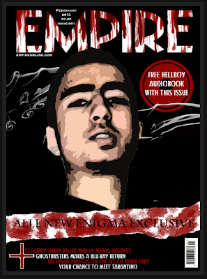
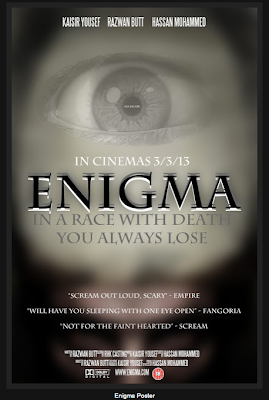
So we have re-evaluated with our media teacher and noted down once again all the things that we feel need to be changed, Comparing it also to the professional edition of Empire.
This was the second edition of our poster, Compared to the last one we added all the necessary information such as the date etc. Then added the white strip as you can see towards the bottom of the image.
One way we looked to see if it was perfect was by looking at it from a distance, then we realised the writing in the circle on the right hand side was not easily read so we then got to work and changed things around, more so then planned.

This is the new improved version of our magazine cover. As you can see we changed the writing and removed the smaller image. And fully changed the main image. The reason is because simply this image looked better, we used a different effect and made the image lighter and it just seemed more outgoing.
This is the new improved poster, There is a lot more text on it and also we needed a catch line which we have also come up with.
One thing we missed through evaluation to give the poster substance was reviews from different magazines eg. We added these few details and they made a big difference.


No comments:
Post a Comment